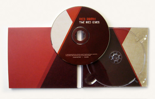
They launched their album on Friday night at the Corner Hotel, and it was great seeing their fans walking around clutching the CD. (Yes, there are people that still buy CDs!)
Most of my design work has been web based, so every time I see my design on a real physical object out there in the "real world" it's still so exciting.
If you haven't heard it, the album is awesome. Big ups to King Charlie on the amazing mix and sweet delay dubby goodness.


1 comment:
I know how you feel re: doing a whole lot of web and getting excited about print work. Prior to starting my degree this year I was heavily into web and now I'm doing a whole lot of print and I feel pretty lost, but I absolutely looooove it. + your work is superawesome, I love the industrial feel of the CD cover, the textural design and the grid like angles. Gorgeous.
Post a Comment